Park Street
Centralizing compliance-driven workflows in a regulated B2B SaaS platform.
View Case Study →I conducted usability research on a two-sided remodeling marketplace to investigate why conversion rates were lower than expected. Through remote task-based testing, I identified friction in how users searched, compared, and evaluated options, leading to strategic recommendations focused on visual comparison and structured information.
DecoClub aimed to provide exclusive remodeling deals through a marketplace model. However, stakeholders lacked clarity around why users were not progressing toward contacting companies and requesting quotes.
The objective was to uncover behavioral friction points affecting decision-making and conversion.
I conducted remote usability testing with five participants who had recently completed home remodeling projects. Participants were given realistic task scenarios, including:
I measured time-on-task, error/confusion rate, and qualitative reactions to evaluate usability and decision clarity.
Participants gravitated toward visuals and project examples rather than company listings. The platform was structured around company profiles, while users were trying to compare projects and materials.
Information across company profiles was inconsistent and broad, making comparison difficult. Users often skipped written content and relied heavily on images to guide decisions.
Because descriptions varied in structure and depth, users struggled to evaluate credibility and differentiate offerings, leading some to leave the app and search externally.
Remote usability sessions — participants completing task-based scenarios
Core tasks demonstrated elevated confusion rates and extended time-on-task, particularly when users attempted to compare options or request quotes. While most participants completed the tasks, the cognitive effort required indicated friction in the decision-making process.
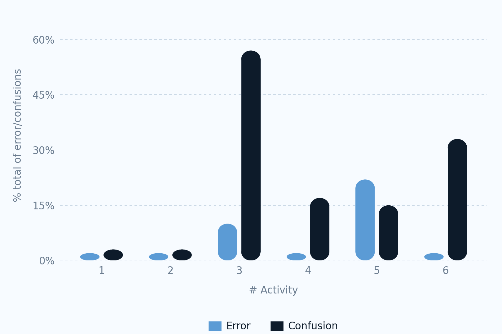
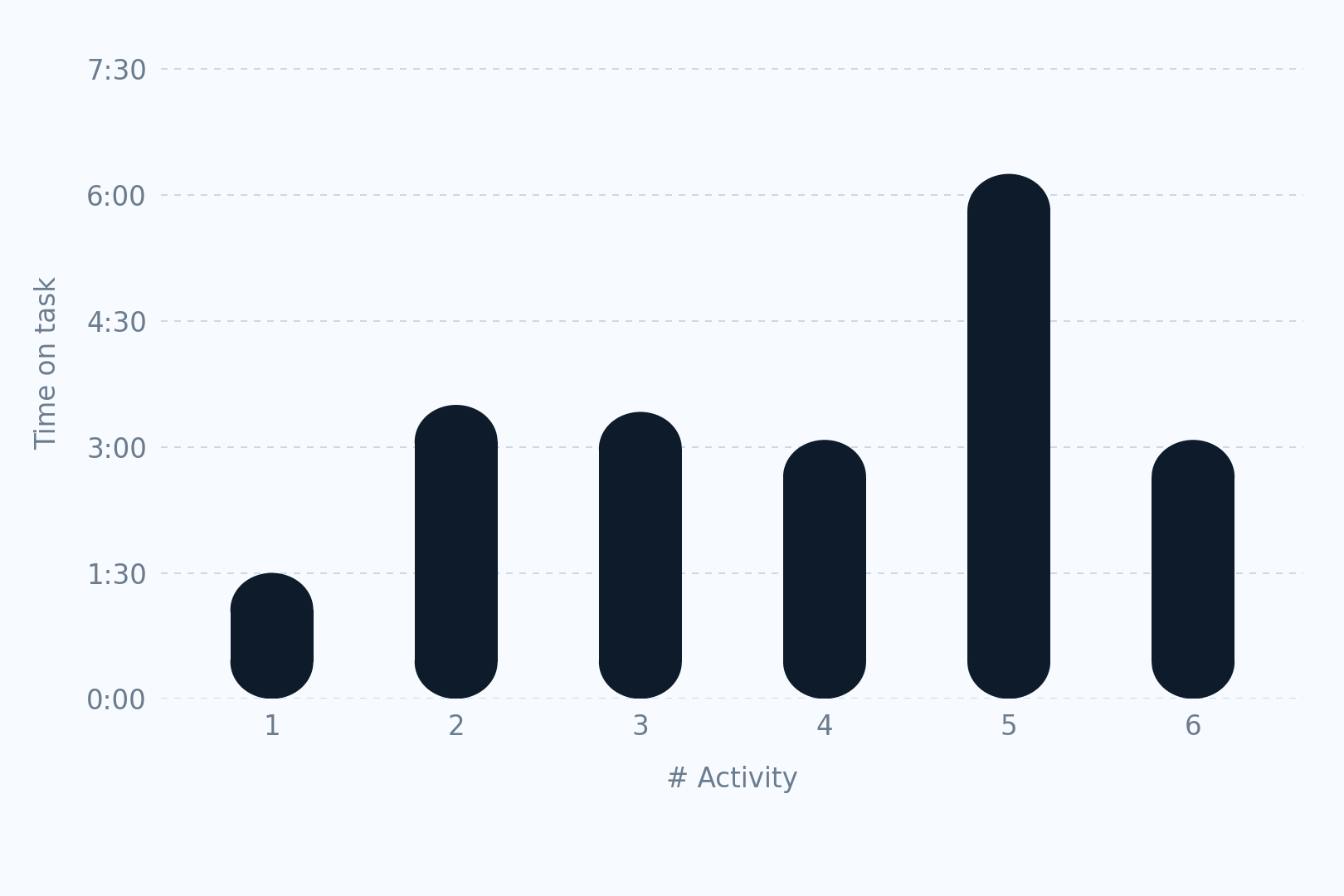
Time-on-task and confusion rates highlighted decision-making friction
Introduce a structured project catalog showcasing completed work, materials, sizes, and high-quality imagery to better align with how users evaluate remodeling options.
Implement consistent company profile structures to enable easier comparison and improve trust.
Reorganize promotional and informational sections to clearly differentiate company offerings from general content.
Project-first discovery model with standardized comparison structure
Testing revealed that users approached the platform as a source of inspiration and comparison, not simply as a directory of companies. This misalignment clarified why conversion was lower than expected.
Although the recommendations were not implemented due to budget constraints, the research provided actionable direction and strengthened my approach to diagnosing usability friction through structured evaluation.
This project reinforced the value of task-based testing for uncovering behavioral patterns. Observing how users naturally approached comparison and decision-making revealed fundamental mismatches between platform structure and user intent—insights that wouldn't have surfaced through interviews alone.
Centralizing compliance-driven workflows in a regulated B2B SaaS platform.
View Case Study →Using research to reshape participation mechanics in an early-stage competition app.
View Case Study →